
Hey! Let's start out the day by recording data for the Feltron, if you haven't already. Then let me know where you are, homework-wise.
Now let's talk correlation vs. causation.
Correlation
When two things change together, we can use a fancy word and say they are correlated. When things are correlated, if we know one, we automatically know the other, at least somewhat. Here's what I mean:If I tell you that a human exists, you don't know much about their weight. The smallest baby ever born (and survive), Rumasia Rahman, weighed a little more than 0.5 pounds (lbs). Jon Brower Minnoch, on the other hand, was the heaviest person ever, and weighed 1,400 lbs at his heaviest. That means that if all I tell you about someone is that "they are a person", and ask "what do you think they weigh?" you only know they weigh between 0.5 lbs and 1,400 lbs - though they probably weigh somewhere in between, 100-200 lbs.
However, if I tell you that the person is 6'3" (6 feet and 3 inches) tall, you know that they weigh more than the smallest human ever. In fact, you can be pretty darn sure they weigh more than 100 lbs... I would feel comfortable betting that they weigh at least 150 lbs.In that example, knowing the height doesn't tell us EXACTLY what someone's weight is (why?), it gives us an idea of what it would be. So we can say that height and weight are linearly correlated. Here is a scatter plot which shows an example of this:
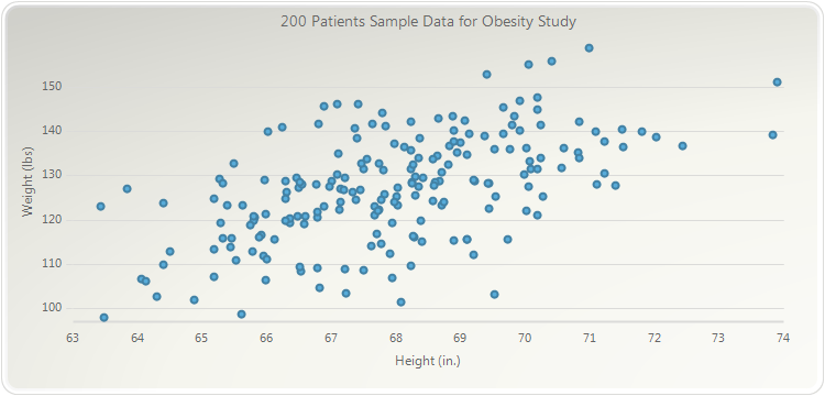
Each person in a study on obesity is shown as a dot in the graph. The taller someone is, the further to the right their dot is. The heavier they are, the further up they are. Find the highest dot... found it? That's the heaviest person. Find the furthest dot to the right - that's the tallest person. Which dot represents the shortest person? The lightest?
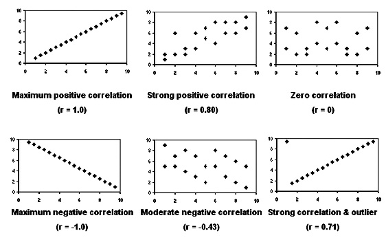
Can you see how even though they don't make a line, as height goes up, weight goes up? That means there is a correlation, but not a strong one. If all the dots made a perfect line going up and to the right, that would be a correlation of 1. Here is all the information on correlation you really need:
Now it's time for a game
You have to play at least 10 rounds of... Guess the Correlation Value! Wooooo!
...Ok, there are more fun games out there, but you're learning something. Also, can you beat my record? I had a high score of 95.83%, and when I finished my tenth round, my score was 85% TRY AND BEAT THAT, YO!
When you finish AT LEAST 10 ROUNDS you have to copy and paste the "Log of Results" box into the form below so I know you did it. (There's more after the form, so keep scrolling!)
When you finish AT LEAST 10 ROUNDS you have to copy and paste the "Log of Results" box into the form below so I know you did it. (There's more after the form, so keep scrolling!)
HERE IS THE LINK TO PLAY THE GAME: Guess the Correlation
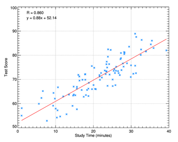
Finally, let me show you the "line of best fit", the line that does the best job of showing what correlated data does. Here are some examples:


For homework
Probability with diceSample Spaces
Simple Probability
Comments