Histograms, Box & Whiskers Plots, and Other Made-Up-Sounding-Things: Continuing to Review and Asses Fundamentals
Actually, everything we are going to talk about today is easy.
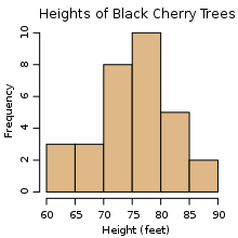
Histograms are a frequency table, that is, the height represents how frequently that value appeared. For example:
Apparently, the most common height for a Black Cherry tree in this study was between 75-80 ft.
Let's get some data about the class: maybe "when do you wake up?," "how tall are you?," and/or anything else interesting.
Now we'll chunk the data - divide it into bins. In the cherry tree example, the bins are "trees of height 60-65 feet, 65-70 feet,... etc" As a side note, when I say 60-65 and 65-70 are separate bins, what do I mean? Where does 65 go?
Alright, let's pick one of the measurements, put them in order from smallest to greatest, and find a few things:
- The minimum (the smallest value)
- The maximum (the largest value)
- The median (median is the one in the middle)
- The upper quartile (the number between the median and the maximum)
- The lower quartile (the number between the minimum and the median)
If we were to graph those, we would get a Box and Whisker Plot:
Though they are always drawn horizontally in middle school math class, I have only seen them drawn vertically out in the wild:
Hopefully they still make sense when they are rotated.
Anyway, if you get that you should have no problem with your classwork. (Note: there are ideas in the classwork that I didn't explicitly say. But I gave you all the pieces you need to figure it out. And you can ask questions):
Finally, for homework, continue working on these concepts (sorry for no links, use the search bar):


Comments