
Histograms, Box & Whiskers Plots, and Other Made-Up-Sounding-Things


Histograms? That sounds hard...


Actually, everything we are going to talk about today is easy.

Histograms are a frequency table, that is, the height represents how frequently that value appeared. For example:


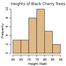
Apparently, the most common height for a Black Cherry tree in this study was between 75-80 ft.

Let's get some data about the class: maybe "when do you wake up?," "how tall are you?," and/or anything else interesting.

Now we'll chunk the data - divide it into bins. In the cherry tree example, the bins are "trees of height 60-65 feet, 65-70 feet,... etc" As a side note, when I say 60-65 and 65-70 are separate bins, what do I mean? Where does 65 go?

Alright, let's pick one of the measurements, put them in order from smallest to greatest, and find a few things:


  1. The minimum (the smallest value)
  2. The maximum (the largest value)
  3. The median (median is the one in the middle)
  4. The upper quartile (the number between the median and the maximum)
  5. The lower quartile (the number between the minimum and the median)
If we were to graph those, we would get a Box and Whisker Plot:


Though they are always drawn horizontally in middle school math class, I have only seen them drawn vertically out in the wild:


Hopefully they still make sense when they are rotated.

Anyway, if you get that you should have no problem with your classwork. (Note: there are ideas in the classwork that I didn't explicitly say. But I gave you all the pieces you need to figure it out. And you can ask questions):

Finally, for homework, some review:


Comments

Popular posts from this blog

Monday 9/28

9/28/15 Monday Check in: Friday class & Homework Classwork: As long as we’re talking climate change... If someone tells you they don’t believe humans are causing it, you might want to ask them if smoking is bad for you. Why? There is as much evidence that humans are causing global warming as there is evidence that smoking causes cancer (you don’t have to click that link, I just like to put it up). Anyway, here’s a chart: It is entitled “Breakdown of the anthropic greenhouse gas emissions by gas, in billion tons carbon equivalent, in 2004” - it is a breakdown of the greenhouse gases emitted in 2004 that humans are responsible for. What’s the biggest greenhouse gas? What’s all that CO2 doing, and where does it go? A lot of it goes into the ocean, which seems better than the air, and it is... up to a point. The more CO2 in the ocean, the more acidic it gets (And the more acidic it gets, the lower its ph gets). That is fine... until it’s not. At some...

Statistical Studies - Tuesday 2/2/2016

Ok, today didn't go exactly as planned. If you saw the blog post I had up planned for today... we will get to that, but I incorrectly estimated how long some work would take you. Not your fault. You guys just move so fast through most material! You are working on the  Statistical Studies topic  on Khan Academy. It is not easy. That is okay. You don't have to get frustrated, or discouraged, or stressed. If it takes longer than I thought it would, I'll give you more time. Some good insights from the classwork: Go straight to the exercises, but go back to the videos if you are stuck If the videos feel too long, you can speed up playback (in the options menu, click the gear button). 1.25x isn't even noticeable. 1.5x is, but if you listen for a while you get used to it and can switch to 2x An "experiment" involves splitting a subset of the population you are looking at into two groups: one called the "control", who don't do anything diff...

Feltron Variables - Monday 2/1/2015

Do you have your tickets... to the gun show? #flexin #doyouevenliftbro Please complete this to show you did your homework: Loading... So, let's talk about what makes this project hard: actually collecting data. It's not hard, but somehow, doing it every day is hard. It's easy to miss a day... then two... then all the sudden, you have missed a bunch, and it's scary and you don't want to think about it, so you don't do it. So we are going to preempt all that by putting some work in today to make it hard to forget. First, we will make a Google form. I started it for you, all you is copy it and add your 4 variables . Once you have that, you are going to use a cool feature of Google Sheets to have google email you this form every day. The form will be in the email itself, so all you have to do is open the email, fill out the form, and hit enter. Here are the instructions to follow . Don't be intimidated! You just have to copy and paste some cod...