Well, everyone did their first and second assignment! Good. You also did them right away. That is interesting... See, first trimester, here is what happened with the second assignment:

 I think it bodes well that none of you procrastinated.
One thing worth mentioning is that this was a “Donut chart.” It is a type of pie chart, it just has a hole cut out of the center. I use donut charts over pie charts every time because I think they look better - but you might not. But I am right.
Please, show me you get what's going on by filling out this form (you will be filling it out a lot, so don't lose this link (it will be on the blog, right here)).
Moving on, here is another chart [source]. This type of chart is called a horizontal bar chart.
 Discuss: What is caffeine? What is this chart telling you? Do you like the way it looks?
Then: fill out the form again! Really, every time you see a chart, fill out the form.
Next up, here we have a chart that looks very similar. It is still a horizontal bar chart, but this is a horizontal stacked bar chart. It is called stacked because every bar is the same length, but broken up into different pieces of different colors:
 [source]. Every bar is the same length. What are the two colors that every bar is made of? What does each color represent? What percentage of kids your age are in school? Now... fill out the form again!
On a different note, the following is a choropleth map, though most people don’t know that name and call it a geo-visualization. (Actually, even the spell check for my blog doesn't know the word choropleth, so good on you for learning it!).
 Let's switch things up and fill out the form! Then, answer: What are the top five states for getting energy from renewable sources? What are some of the worst? Approximately what percent of California's energy comes from renewable sources? You may have to look at a map with the states labelled:

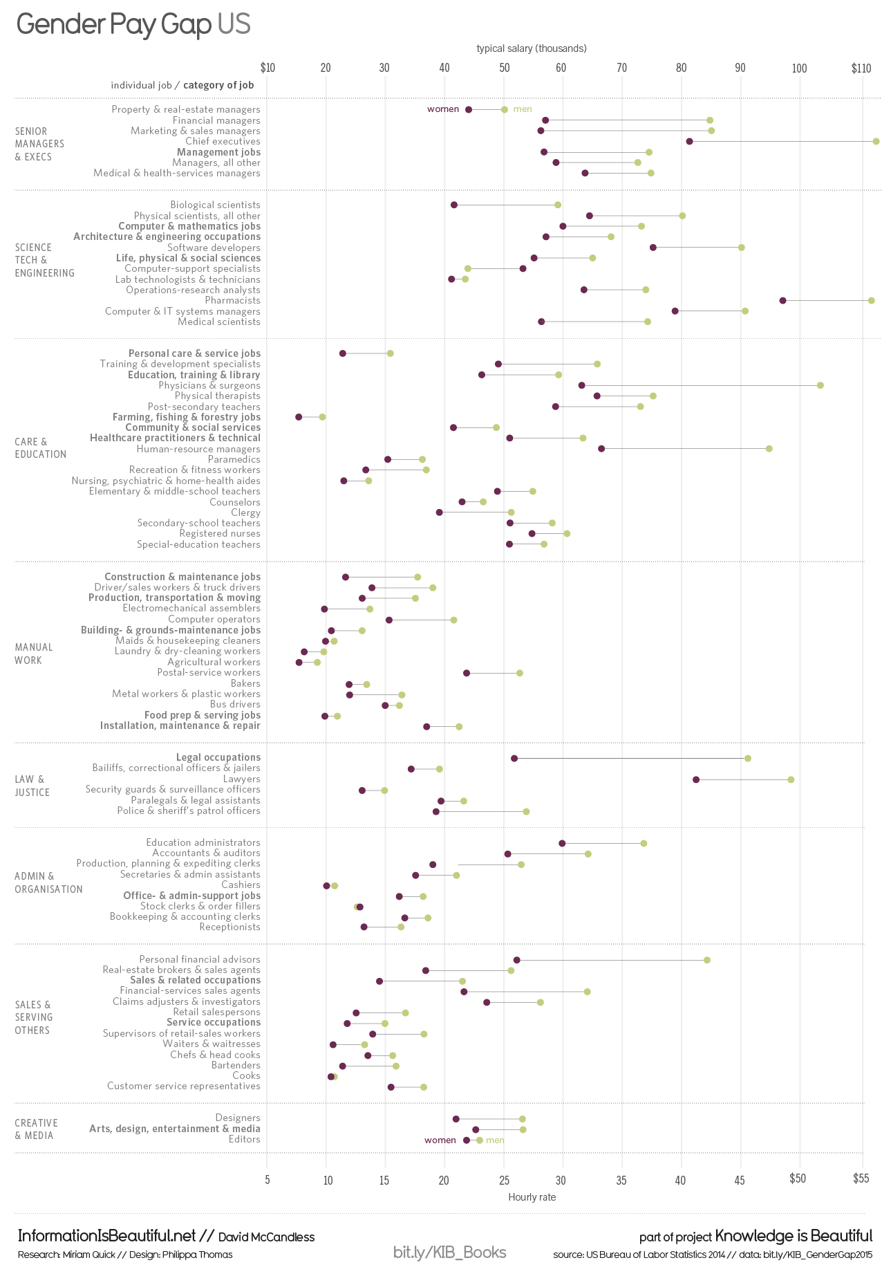
Finally, your homework is to check out the following chart and fill out a different form (it's below the chart)!

One thing worth mentioning is that this was a “Donut chart.” It is a type of pie chart, it just has a hole cut out of the center. I use donut charts over pie charts every time because I think they look better - but you might not. But I am right.
Please, show me you get what's going on by filling out this form (you will be filling it out a lot, so don't lose this link (it will be on the blog, right here)).
Moving on, here is another chart [source]. This type of chart is called a horizontal bar chart.

Then: fill out the form again! Really, every time you see a chart, fill out the form.
Next up, here we have a chart that looks very similar. It is still a horizontal bar chart, but this is a horizontal stacked bar chart. It is called stacked because every bar is the same length, but broken up into different pieces of different colors:

On a different note, the following is a choropleth map, though most people don’t know that name and call it a geo-visualization. (Actually, even the spell check for my blog doesn't know the word choropleth, so good on you for learning it!).

Finally, your homework is to check out the following chart and fill out a different form (it's below the chart)!
Comments